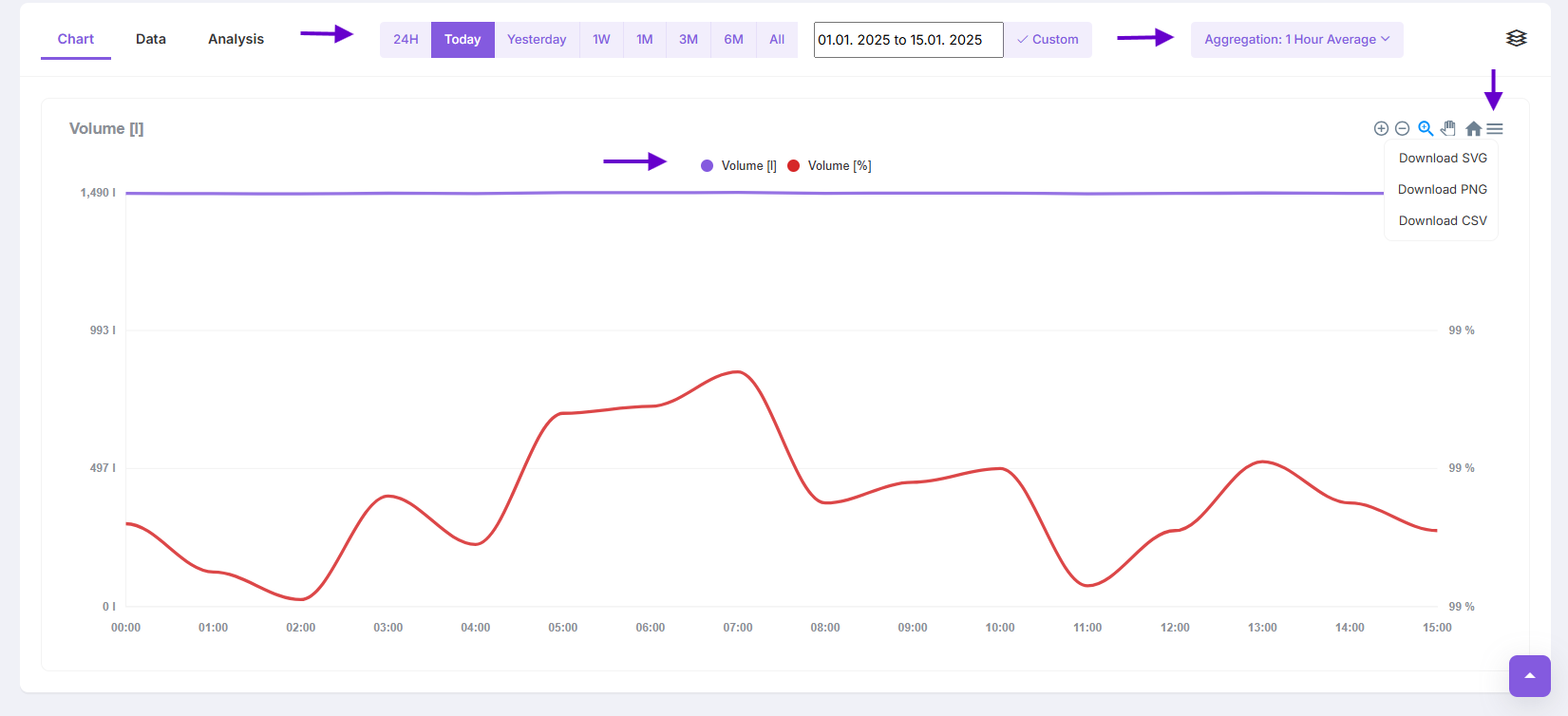
Chart
Chart section provides visual representation of the data collected by sensors over time. This feature helps users monitor trends, identify patterns and make data-driven decisions.
Chart settings
-
Time Range Selection: Users can choose predefined time periods such as 24H, Today, Yesterday, Weekly or specify custom date range
-
Aggregation Options: Allows averaging data over time intervals to smooth out fluctuations and better understand trends
-
Zoom and Scroll: Tools for zooming into specific timeframes or scrolling across the timeline to examine details
-
Overlay Options: Toggle specific data points to focus on key metrics
-
Download Option: Users can export the data into formats like CSV or Excel for offline analysis or integration with other systems
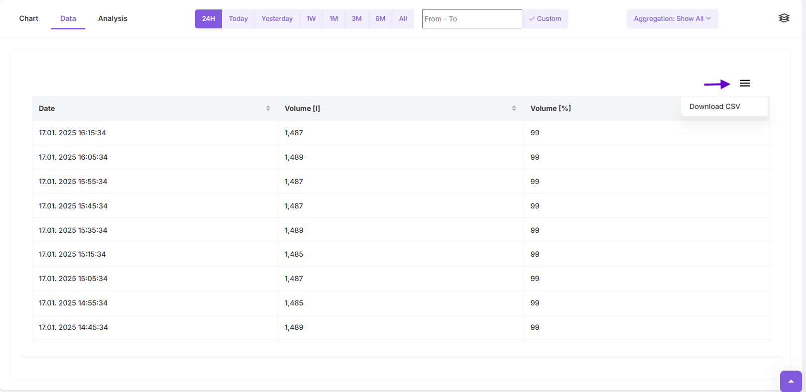
Data
Tabular View
Data Tab Displays raw sensor data in a table format, including parameters like time, volume, and percentage values Allows users to sort or filter data for more in-depth analysis
Download Option: Users can export the data into formats like CSV or Excel for offline analysis or integration with other systems
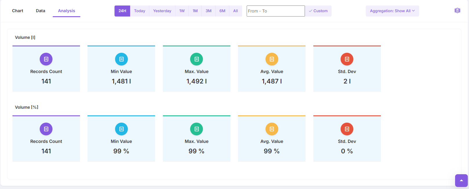
Analysis
The Analysis Tab provides a comprehensive summary of sensor data within a selected time range, helping users quickly understand trends, patterns and anomalies
Features of the Analysis
-
Records Count: Shows the total number of recorded data points within the selected timeframe
-
Min Value: Displays the lowest recorded value for the parameter
-
Max Value: Highlights the highest recorded value
-
Avg. Value: Displays the average value for the selected period, providing an overview of typical conditions
-
Standard Deviation: Indicates the variability in the data. A low standard deviation reflects consistent measurements, while a high value suggests greater fluctuations
-
Timeframe Selection: Users can select predefined timeframes or define custom range
-
Aggregation Options: Users can toggle the aggregation settings to control how the data is grouped and presented